MEDIAWATCH: So is anyone going to say something about Stuff’s new design?
Cough.
Soooooooo. Is anyone going to say something about Stuff’s new design?
I feel between Golriz’s shoplifting and NZ declaring war on one of the poorest countries on earth that we all missed Stuff’s garish design ‘upgrade’.
And I’m using the word ‘upgrade’ as broadly as I can.
Is no one going to start being mean?
Ok.
Let me kick it off then.
It hurts my eyes!
The colour code feels like it’s been dictated to by the Trans Rights Flag colour palette.
Slightly off primary colours in an ugly beige Neapolitan ice cream colour scheme that manages to make the entire look of the site feel juvenile.
It’s like the Rainbows End Community noticeboard, but younger.
This section feels like Tinder for TicTok.
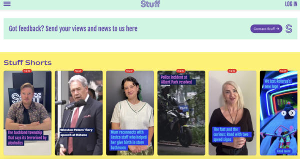
It feels cheap and they’ve managed to rob authority from their own news product.
It’s like a social media platform for girls who go to private schools, if that was what they were aiming for, they’ve nailed it.
It’s so surprisingly ugly.
Stuff is like a 50 year old women dying her hair purple and cutting it short and demanding we all love it.
We don’t love it.
Increasingly having independent opinion in a mainstream media environment which mostly echo one another has become more important than ever, so if you value having an independent voice – please donate here.
If you can’t contribute but want to help, please always feel free to share our blogs on social media.


I take my last comment back. There was a moment where the site worked briefly.
Ms Boucher and members of the PMC are obviously dedicated to the rule: NEVER ADMIT YOU MIGHT HAVE BEEN WRONG, A BIT WRONG, OBVIOUSLY WRONG OR EMBARASSINGLY WRONG.
Apply as much bullshit and spin ( often under the guise of supporting your ‘TEAM’ in the spirit of solidarity ) until it becomes bleeding bloody obvious that the ‘brand’ is no longer viable.
Absolute shambles. Looks hideous.
Hilariously, the story they posted singing the praises of this “bold, new” makeover had over 300+ comments before it was closed off, and I think about 8 in total were complimentary:
https://www.stuff.co.nz/about-us/350128999/stuffconzs-new-website-bright-bold-and-innovative-core
Some people described the changes as “unneeded” and “much-hated”. The responses from Stuff – while trying to fix problems – gave me the impression they didn’t test it properly, and probably didn’t think to ask anyone outside of the lunchroom whether they would like a change to the page or not.
For my part, I can’t even get the new page to load properly in any browser (stuck in a ridiculous loop), so after having Stuff as my homepage for over 10 years I’ve moved elsewhere. I have a feeling I’m not the only one who feels this way and their traffic will drop off noticeably after this “improvement”.
The old adage is true – if it ain’t broke (and their old page worked perfectly for me), don’t try to fix it.
It’s dreadful but not as dreadful as it’s content, the inane reporting from inexperienced nobodies and it’s patently obvious lefty hand wringing and inability to accept a new government.
Jack. “… the inane reporting from inexperienced… “ Yes. They’re pretty bad. As Joy comments, they’re infantilising, but that’s simply the level at which they function. Colours don’t matter, content should.
Well Ms Boucher, I think that’s pretty well unanimous and I fear for @ Bomber’s mental well-being. I’m wondering how the hell He’s going to access His BFF Damien’s words of wisdom once a week.
The re-brand/re-ummij has become much more serious than you could possibly have anticipated in this space, going forward. You COULD have blood on your hands.
Madam, let “Us” know who was responsible for this abomination, or revel in martyrdom and go begging for more handouts from gummint in order to preserve the impotence of journalism and the 4th Estate.
(Easier optiom: Mea culpa, ‘Sorry, We got it wrong’. And just reverse the whole fucking thing)
I get the impression that they’re going to ignore the 10,000 comments that hate it and only listen to the 50 that like it, thereby changing nothing. A pity.
Actually, I think they might already have realised they made a gigantic cockup, and although they’re not going to admit it. there are signs a gradual reversal of at least technical aspects of this complete fuckup are being reversed.
Ha ha yes it’s truly awful it’s like…the designer looked at the use of colour and layout on The Guardian website and said yeah right we’ll do that but change the colours to sick pastels for point of difference ….and no idea why they have to have that annoying S spinning away. It would have cost a fair bob to make those stupid changes too…
Horrible colour scheme. I love green but not with purple.
Much less informative looking.
You have to go miles to find something you’re half interested in.
They won’t let you comment.
Articles seem short and lack detail.
It’s been infantilized. Adults needn’t bother.
Haven’t looked today, life’s too short.
They got rid of the Technology section too, something I used to read quite regularly.
I thought I’d accidentally ended up on the Spinoff….shudder.
A waste of time navigating around it, and they seem to require a log in, by name, to do the quiz. No thanks. My bros used to have comics a little like this, but with much better continuity. I now check Radio NZ first for news, and even the Herald, making a guess about what’s behind the paywall.
Always liked the trivia challenge. But I’m dammed if I’ll let them sell my information (log in) so I can now do it.
If radio stations can still earn a dollar without subscriptions, why can’t news outfits
Johnr. I’ve never logged in for quizzes, so I was perturbed to receive an email from them, inviting me to join in some quizz competition and be in the running for some sort of prize. I deleted it.
Absolutley hate it – I haven’t gone onto the site (except maybe twice with an accidental click) since the rebranding, and hoping there is a similar decrease in traffic which will show it was a collosal mistake.
I tweeted/Xed about it the first day it was launched. It used to be one of my go-to sites in the morning. I stopped going to it the day I saw the catastrophe of their new version.
It hurts my eyes, too.
It looks like a tabloid. Awful on a laptop, with less info per page – must have been designed for the small screens of mobiles… and small minds.
It said you needed a new phone app so I deleted the old one & haven’t been back. I was a subscriber to The Press for about 25 years but my views grew increasingly different from most of their content so I followed the advice “why have a cow when you get milk at the gate” & just read the internet version.
The site doesn’t work on the desktop version of Chrome.
That’s funny, that’s the exact method I used to access it.
I like the colour, I like what a single page looks like, I like the initial headline area look, but then it becomes a hard ask as I hit a whole bunch of fares that I have zero interest in. It ends there. Quite happy that I finally bumped my subscription just before this change.
Brand Managers should be isolated at birth!
I’d rather name and shame them. That fucking egg roll that ran/runs the Post Office fell for the re-image/re-brand crap. A missed opportunity for an all-of-gummint service centre (local and central), AND as an option to provide banking services where banks withdraw their branches – especially in rural areas. What a frikken pillock!
These sages are held up as some sort of oikons. In reality they’ve had imagination bypass surgery.
And did you notice Stuffed’s Glen McConnel’s? peice on the PS Commissioner replacement. What a ragtag group of PMC neo-liberal options. Especially that old dowager that currently purports to manage The Munstry of Everything. (POSSIBLY slightly better than the current old closet). Maybe you didn’t see that. Glen Whatshisname’s piece probably kept scrolling past you and was lost in a purple haze
We’ve done gotten what we deserve
OnceWasTim. Perhaps you may be talking nonsense.Nobody deserves being dumbed down by the dumb, even if they are playing from the same song book as the ghastly university vice chancellors and other adherents of the neoliberalism which operates on a ‘ divide and rule’ dynamic.
It’s a shocker for sure. Another rebrand just for the sake of it.
It keeps triggering refresh (in Chrome at least) meaning an auto scroll up.
I can’t understand all this preoccupation with re-imaging and re-branding just for the sake of it.
Do you really care for example if your parcel gets delivered in a blue and red van with a knob logo rather than a yellow and red van. Costs passed on to the gig worker already struggling?
Are you more comfortable now Countdown is now Woolworths? More fool you if you’ve been conned.