Why simple visuals make everyday moments feel more intentional

There’s something comforting about clarity. Whether it’s a neatly written note, a thoughtfully set table, or a journal page that isn’t overcrowded with thoughts, simplicity has a way of slowing us down. In a world that constantly pushes for more — more content, more colour, more noise — clean visuals can feel like a quiet exhale.
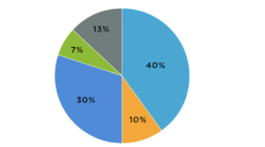
That’s why many people are becoming more intentional with how they present ideas, plans, and even small creative projects. From organising personal goals to sharing insights online, simple visual tools help transform scattered thoughts into something meaningful. Even something as practical as using a free pie chart maker can turn abstract numbers into a visual that feels approachable rather than overwhelming.
When visuals Support Thoughtfulness
Not everything needs to be decorative to be beautiful. Often, the most effective visuals are the ones that gently support the message instead of competing with it.
Think about how much easier it is to reflect on something when it’s presented clearly. A simple chart can help you understand where your time goes in a week. A clean layout can make journaling feel less intimidating. Visual clarity creates mental space, and mental space invites reflection.
This idea applies just as much to personal projects as it does to shared content.
Everyday uses for gentle data visualisation
Data doesn’t always belong in boardrooms or reports. We interact with it constantly in everyday life, even if we don’t label it that way.
Some quiet, practical examples:
- Tracking how you divide your time between work, rest, and creativity
- Visualising monthly spending to bring awareness — not judgment
- Breaking down habits or routines to see what’s actually sustainable
- Sharing insights in a blog post without overwhelming readers
When visuals are simple, they feel less like analysis and more like insight.
Why pie charts feel so intuitive
Pie charts have endured because they’re immediately understandable. There’s no learning curve. A quick glance tells a story.
They work especially well when you’re exploring balance — how one thing relates to the whole. That makes them ideal for lifestyle topics, where the goal is often awareness rather than precision.
Instead of asking readers to interpret numbers, you invite them to see relationships. That small shift makes information feel human.
Designing with calm in mind
The most effective visuals often share a few qualities:
- Limited colour palettes
- Clear labels
- Plenty of breathing room
- No unnecessary effects
When visuals feel calm, they’re easier to trust. They don’t demand attention — they earn it.
This is especially important in lifestyle spaces, where readers are often looking for grounding rather than stimulation.
Sharing without over-explaining
One of the quiet strengths of good visuals is that they reduce the need for excessive explanation. A thoughtful chart can replace paragraphs of justification or clarification.
For writers and creators, this creates space to focus on storytelling instead of over-contextualising. For readers, it creates a smoother, more enjoyable experience.
Visuals become part of the conversation instead of an interruption.
Letting simplicity be enough
There’s a subtle confidence in choosing simplicity. It suggests intention. It signals care.
Whether you’re organising your own thoughts or sharing ideas with others, clean visuals help you communicate without adding noise. They allow meaning to surface naturally.
Conclusion
Not everything needs to be complex to be meaningful. Sometimes, the most delightful moments come from seeing things clearly — without distraction or excess.
By using simple visuals thoughtfully, we create space for understanding, reflection, and connection. And in a busy world, that kind of clarity is something worth noting.


