The one chart by Matthew Hooton you must watch to see Omicron Tsunami
Hooton came up with a very clever Omicron chart that basis itself on a 33% increase, he’s calling not the ‘Hootonian equation’, I suspect he did this to shit all over the modellers advice so that he could attack the Government’s credibility.
Unfortunately it’s turned out to be excruciatingly precise and we need to keep an eye on it because it’s a terrifying overview of where we might be going with caseloads…
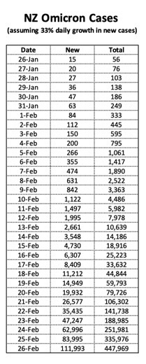
…most of the Omicron outbreak has looked like this, a very slow spotty start and then obscene lift off.
We are enjoying mocking the modellers while screaming for MIQ to open while cheering Charlotte Bellis, but look at where Hooton predicts we will be buy the end of February, 111, 993 cases in a day????
I don’t think we are ready for what comes next.
Increasingly having independent opinion in a mainstream media environment which mostly echo one another has become more important than ever, so if you value having an independent voice – please donate here.
If you can’t contribute but want to help, please always feel free to share our blogs on social media


Give it away Bradbury, neither the ‘ official ‘ modelers or Hootons model are anywhere near accurate. All these arse wipes are doing is quoting wildly inaccurate figures for pure political gain. Take it all with a grain of salt. That these wankers are doing this to spook the NZ public is despicable.
wk yes take it all with a grain of salt – because a lot of it is notional, but possible and some is just too wild for responsible publicity! It just adds to the paranoia when huge figures get touted. Don’t you get paranoid wk we need your interesting observations and knowledge to add to the mix in the moshpit!
Don’t worry – we only have capacity to undertake circa 50,000 tests per day – so we will never be able to reach 111,000 confirmed cases…
But seriously – case numbers will escalte quickly now. I suspect that numbers will lag behind the Hootonian model for the next few days and catch up again next week due to less tesing taking place over the long weekend.
This chart seems to fill a gap in the available information on Covid numbers. I want to see the new cases on a column basis with cumulative additions on the side. Not just hear today’s – say 202 – I then want to know yesterday’s and the day before etc. A short explanation about the R factor and the infection days multiplication etc. too.
Graphs show quickly the trends, a lot of information, new set against historical. But the numbers piled up in a neat column properly labelled is going to tell me just how things are going. The numbers could also be split up into basic Covid19 with another column for confirmed Omicron.
A rule of thumb of a third additional every day is notional. Let the concerned professionals put out the chart I have suggested, information that’s reliable at a glance. Hoots is inclined to be off the chart all the time but has had a good idea.
I,m grateful that thanks to Labour that we are now facing an Omicron threat rather than Delta, and that vaccination is so now so high. While we may all eventually get some form of Covid, my strategy is to try and sidestep Omicron in hope of milder future strains or it dying out thanks to better vaccines. Try to just watch from the sidelines for a bit and see how things play out. No-one knows the long-term effects of Covid yet. It could cause anything from impotency to memory loss to lung cancer a decade or two down the track. The longer one can avoid it the better I reckon. A great opportunity for people to spend less time on consumerism and instead enjoy their time outdoors. Take up some new hobbies and learn something new. Harden yourself up to a bit of fresh air. They’ll be plenty time for shopping and nite-clubbing again in the future. Look at the Spanish flu. A few years the roaring 20,s are kicking off, the jazz age etc.
Nice input 🙂
Modellers were predicting 50,000 – 80,000 new mild illness cases (aka Omicron) per day by this weekend but the nation only managed a flaccid 100 per day. I think even the coronavirus particles are over it. Modeller Hooton though stands erect and predicts Luxon will be a magnificent leader who will unite New Zealand.
Modellers offer a range of figures, best scenario to worse scenario.
It’s the scientific illiterates that take the extreme and run with it, as you have.
“… best scenario to worse scenario …”
You’re on the money there RC. And an aditional reminder … to capture those different scenarios modellers play with a range of ‘inputs’, or variables. A science, yes, but bit of a moving feast.
Will put Hooton’s chart up on the wall. We’ll see.
‘Modeller Hooton?’ standing erect thinking about Chris Luxon. Shudder!
Who cares? Omicron is a slightly worse version of the colds we have experienced for centuries. 99% of the 111k cases will have a sore throat and a runny nose but will recover in a week. Why we are continuing to torch the economy, creating massive backlogs in other health areas, destroying social cohesion/mental health metrics/educational standards and creating policies that pump money into the arms of asset holders at the expense of the poor. The preoccupation with COVID and the impact that Labour’s choices have had on the NZ public are absolutely shameful.
Okay so my doctor/ occasional drinking buddy explained in to me this way.
The doctor says that you have a mild/moderate viral infection (common cold); me, the patient, says I’m dying I’ve never felt so sick….
The new version on covid is still a nasty bug, certainly worse than the usual common cold.
Logic would suggest therefore, with a few exceptions, the luxury of spending 10 days or more self isolating with testing galore as the government wants just in case is utterly pointless and that in itself will do far more harm than good.
Those exceptions would be aged care facilities. But even then as Australia has found, those areas have run disastrously short of staff.
Battening down the hatches is futile it would seem.
He’s half correct.
These are “vegetative growth curves” which show geometric growth at the start. But once infected people start to infect people who have already had it so are immune, the curve tops off and the decline starts.
As I’ve been saying for the last two years – this thing only truly ends when when we’ve all been infected.
So everybody got polio before it ended? Smallpox?
Face it Andrew, you talk out of your arse.
People who have previously been infected with OG, Alpha, Beta, Gamma, Delta, Epsilon etc, are not immune to Omicron.
Omicron has infected those previously infected and those new infections have gone on to infect others.