
I’ve been working on multi-country data in recent weeks, calculating private-sector financial balances from data on government financial balances and from balance of payments information. The results help place both the New Zealand Government’s drive for a fiscal ‘surplus’, and the Eurozone’s obsession for balanced budgets, into perspective. And they show that the system of exchange rates completely failed to achieve what policymakers expected of it.
The first thing to note is that every single person, household, organisation, government, sector and country has an annual surplus or an annual deficit. (A deficit is a negative surplus; and a country’s surplus is its ‘current account’ surplus, not its government surplus.)
My personal surplus is my after-tax earnings plus any monetary gifts received (‘transfers’) [blue] less my spending, interest paid and donations [red]. If, for a 12-month period, the red items exceed the blueitems, then I am running a negative surplus – a deficit.
These surplus and deficit balances together form a ‘closed system’. By definition, and for the world as a whole (but not for individual countries), these aggregated private and public balances must add to zero.
This chart might look a bit esoteric, but it’s not too hard to follow. Each dot represents a country. There’s a lot in it though; 100 representative countries for starters.
The average private sector balances for each country for the last 20 years are shown horizontally, and government balances are shown vertically. The systemic constraint (ie the requirement to balance at zero) is represented by the dashed ‘line of current account balance’. Essentially, half the countries should be to the left of the line; the other half to the right. (There are actually more countries to the left, because smaller countries are more likely to be to the left of the line.)
New Zealand is the big red dot well to the left. Its position says that New Zealand’s households and businesses have been running, on average, annual deficits that sum to five percent of New Zealand’s GDP. Essentially it means that the private side of the New Zealand economy has been spending on 5% of GDP more than its revenue. On the other hand the government side of the New Zealand economy has been spending, on annual average, 1% of GDP less than its revenue.
Almost exactly opposite of New Zealand is China, whose private sector spends 5% of its GDP less than what it earns, and whose governments have spent 1% of GDP more than they earn. Germany sits very close to China.
For the world-system of nations, the average private balance has been +1.65% of world GDP, and the average government balance -1.65%. That suggests that, from 1995, the governments of the world have been increasing their debts to the world’s households and businesses by close to 2% of world GDP per year. (This figure does not represent a global problem; world inflation erodes that government debt as it accumulates.)
We note that the most obvious group of ‘surplus’ countries are the oil-exporting nations. This is as it should be. These nations – private sector and governments – must save now because their oil reserves will one day either run out or become superseded by some other fuel.
What is a problem, is this: the chart, which covers 20 years, should show countries much more clustered around the ‘current account’ line. (Substantial dispersion from the ‘current account’ line should be common for periods of under a decade, but not for periods of 20 years or more.) This shows that the system of floating exchange rates does not work much like the textbooks say it should work. The exchange rate system is supposed to act like a thermostat, keeping countries close to that line.
Further, from a point of view of capitalist dynamics, there should be many more countries in the same part of the chart that New Zealand is in. First, such countries play a critical balancing role, given the preponderance of countries on the opposite side of the chart. Second, it is private-sector spending (especially investment spending) that is supposed to drive the whole system. Thus the present crisis of capitalism is reflected in the paucity of countries in the same risk-taking quadrant as New Zealand. New Zealand is, in many ways, truly an exceptional country.
The countries to the left of Australia shown on the (first) chart above are: New Zealand, Estonia, Latvia, Iceland, Bulgaria, Serbia, Belarus, Kazakhstan, Panama, Fiji, Jamaica, Samoa, and Cameroon. Mainly ex-Soviet and developing countries.
Below is a second chart, which give the same information, but for the years 2010-14 only (using IMF estimates for 2014). Estonia, Iceland, Latvia and Lithuania are shown as a group on these charts. During this half-decade, Iceland has moved out of this private-sector deficit zone, following its financial collapse.
In the last 20 years it was the new Baltic States (Estonia, Latvia, and Lithuania) which, as a group, looked most like New Zealand and Australia. However, now that all three have joined an austere Eurozone, they have moved substantially rightwards, as have the indebted Eurozone countries (disaffectionately known as PIGS), and as has Australia. Of these more-developed economies ‘on the left’, only Estonia and New Zealand remain on the left side of the chart this decade.
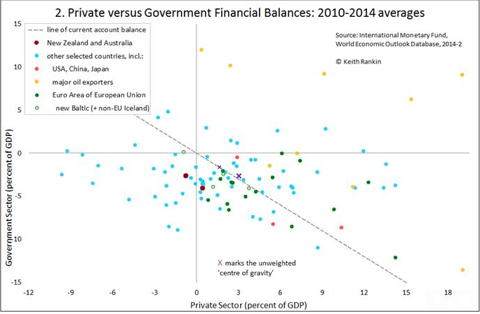
Essentially, when countries move (on the charts) to the right or move upwards, that has a dampening effect on the world economy, adding to world unemployment. (The Eurozone as a whole has clearly moved to the right.) When countries move to the left, that has an invigorating effect, or at least it counters dampening elsewhere in the system.
On the second chart the ‘centre of gravity’ has moved down to the right. When all is netted out the fundamental change is that people are increasingly lending to their governments, both in lieu of paying taxes, and in lieu of lending to businesses. We are saving more and investing less.
After the 2008 global financial crisis, the general dynamic was for the global private sector to shift right; to reduce borrowing, to increase saving, and to repay debt. (This condition came to be known as a global balance-sheet recession.) This private right-shift was initially accommodated by governments moving down the chart. Governments spent more, compensating for private parties spending less.
From 2010, however, a new ‘austerity’ dynamic took over. This was when the Eurozone crisis took hold, and it’s when governments around the world replaced fiscal accommodation with ‘fiscal consolidation’. This meant that there was a substantial policy dynamic – across the board – to move up the chart. Once again, key economic agents – this time governments – were seeking to move away from the ‘current account’ line, and in a way that aggravates unemployment and precipitates deflation.
Eurozone countries on the left of the first chart – such as Greece and Spain – were being forced to move closer to the current account line. The policy intent was to move them up; the reality of austerity was to move them to the right. The policymakers’ expectations were that public sector austerity in the European Union would liberate their private sectors into taking on a lot of new debt. Fat chance; even very low interest rates are not achieving the required levels of private debt.
Further, the expectation was that the Greeces and Spains would respond to an ‘internal devaluation’ (read ‘drastic wage cuts’) which would further render the export sectors of these countries ‘competitive’. The vision was of the Eurozone as a whole becoming like a big export‑oriented factory, delivering masses of goods and services, on credit, to the rest of the world.
This attempted movement towards both public sector and private sector surpluses is impossible however for the world as a whole to achieve, due to the zero-sum constraint. It means that reduced government deficits can only be achieved through decreased private-sector surpluses.
A significant number of countries’ private sectors, mostly in South America and Africa, have accommodated much of the decreased spending in the established developed countries, by taking on more debt, by selling assets such as land, or by receiving direct foreign investment (such as that by China in Africa and the Pacific). Also we note that China (also the other BRICS) has accommodated by moving left a little. (Note that, under the dynamic of this decade, accommodation – ie stabilisation – represents any movement left or down by any country.) Even Japan moved closer to the ‘current account’ line.
The world economy remains weak and deflation is taking hold. The policy dynamic is for countries to move up (reduced government deficits) and or to the right (higher private savings rates). Offsetting new debts in developing countries are inadequate, and are making those countries even more vulnerable. In taking on liabilities to balance the savings glut in the developed world, these African and South American and Oceanian countries stand to become the Greeces and Spains of the 2020s.
Under present circumstances, New Zealand is likely to revert back towards its 1995-2014 average. New Zealand, through its monetary policies, unintentionally acts as a substantial absorber of the private surpluses of other countries. Had Labour ‘won’ the 2014 election, David Parker would have been taking New Zealand in the same direction as Greece and Spain – to the right on the chart.
A final point to note here. Japan and the USA are now really post-industrial economies. Their balance sheets are converging, towards the bottom-right of these charts. Both countries’ private sectors have become highly resistant to tax increases, while also highly dependent on government spending. The two sectors in these countries have become financially co-dependent. The core dynamic is that Americans and Japanese prefer to lend more to their governments than to pay more taxes.
In a sense government borrowing and taxation are the same; just as war bonds were really taxes dressed up as savings. If people lend to their own governments what they do not wish to spend, then that can be a stable outcome, so long as they accept that their governments must spend what households and businesses lend as if that money was revenue. And they must pretend that their governments’ ability to sustain debt is infinite.
If private parties in either of these two huge post-industrial nations – USA and Japan – seek to bankrupt their own technically insolvent governments, then that whole co-dependent economy crashes in a kind of financial Armageddon. So the private creditors of these governments will not initiate their respective equivalents of financial nuclear war. They will pretend to believe in their governments’ empty promises to repay public debt; their other choice is to pay much more tax.


Japan is the future.
It’s true. We are all Japan now, caught in the near ZIRP (Zero Interest Rate Policy) trap. Raising rates guarantees a total collapse of the housing bubble (no government will allow that to happen, given NZ’s love affair with property). Naturally super low interest rates leads to massive amounts of credit speculation – Japan is now at 500% of GDP in debt. In other words, the proverbial bug in search of a windshield.
http://www.marketoracle.co.uk/Article48881.html
http://www.marketoracle.co.uk/Article49044.html
Not raising rates guarantees an even more total collapse of the housing bubble… Without any control at all.
Well done Keith. Brilliantly explained.
This article seems out of context to the usual political fare on TDB.
I wish New Zealand had a economic website/forum where issues like this could be discussed.
A place where people can meet and debate these sort of issues in a non-partisan way.
interest.co.nz may be what you seek.
Well researched Keith,
“Eurozone countries on the left of the first chart – such as Greece and Spain – were being forced to move closer to the current account line. The policy intent was to move them up; the reality of austerity was to move them to the right. The policymakers’ expectations were that public sector austerity in the European Union would liberate their private sectors into taking on a lot of new debt. Fat chance; even very low interest rates are not achieving the required levels of private debt. Further, the expectation was that the Greeces and Spains would respond to an ‘internal devaluation’ (read ‘drastic wage cuts’) which would further render the export sectors of these countries ‘competitive’. The vision was of the Eurozone as a whole becoming like a big export‑oriented factory, delivering masses of goods and services, on credit, to the rest of the world.”
Yes and see Greece today, hooray!
As for holding a right wing fiscal policy of borrow to speculate, we may as well play with paper money and like the game “Monopoly” as FJK and the NatZ do by borrowing from foreign banks every week to speculate on property which does not produce anything & only will prop up our shrinking production of other goods such as Industrial comodities like using our raw materials we should be producing again to send as finished products abroad.
Untill we do expand our dying industrial base again we are borrowing to just stay afloat.
Greece has today totally rejected this right wing borrow to speculate policy for a return to people power inclusion in the political system unlike our NatZ who are isolation us from our free speech and inclusion as we speak and we should follow Greece also in NZ, and rid the Emperor with no clothes.
Comments are closed.